Deploy
01. Overview
Deploy is a revolutionary idea that’s changing how ERP professionals connect and work together. It’s designed to help ERP Independents find and hire experts for important tasks. By creating a digital community, Deploy makes it easy for users to connect and collaborate. Deploy’s goal is to be the main platform for ERP Independents to show off their skills in a private, online setting. This way, they can share ideas, solve problems, and come up with new ways to do things.
Completion Date:
Dec 2024
Project role:
Designer
Project type:
Mobile app
Project length:
3 months

02. Key challenges
Starting from scratch.
Challenge
The initial concept from the client was very specific to the field of his speciality of work which meant he had a fantastic depth of knowledge but this didn’t always translate well when it was explained to different user testers as the project developed.
Solution
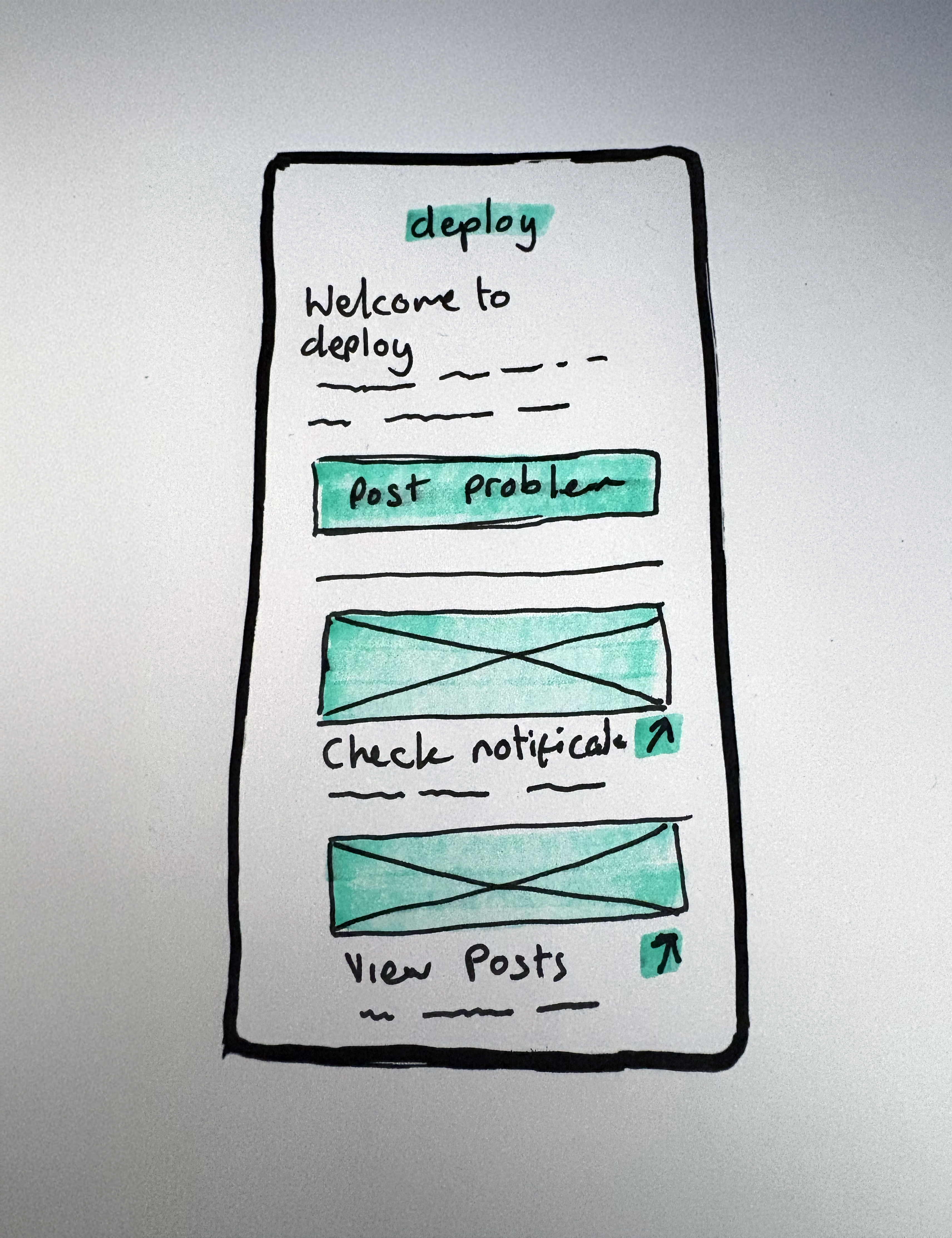
We kept iterating on the concept and distilling it down the main points for this MVP with a detailed and comprehensive plan as to how the overall project would develop in future phases.
Time is money.
Challenge
The client also ran a successful full time business alongside this project which, whilst being related to his field, wasn’t always his main focus.
Solution
Setting up regular calls for catch ups, regular updates and direct communication via messaging channels we were able to ensure every time we sat down to discuss the project, ask questions or present work it was done in a timely manner and optimised both project time and the clients time.
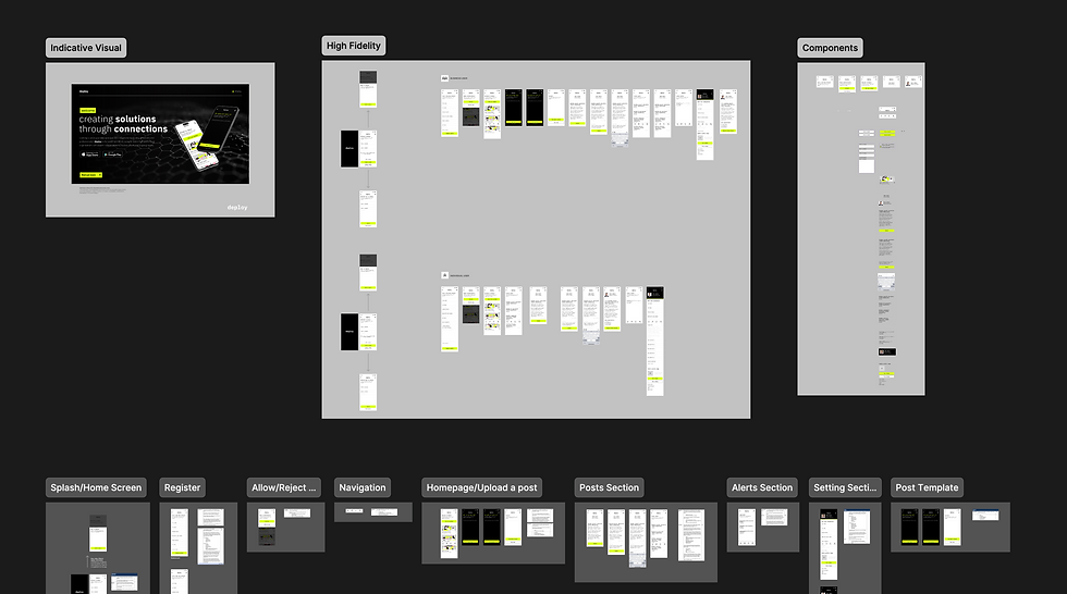
03. Project breakdown
The devil is in the detail.
Overall identity
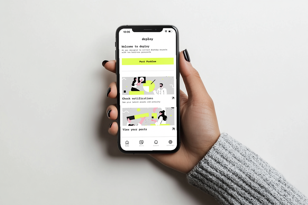
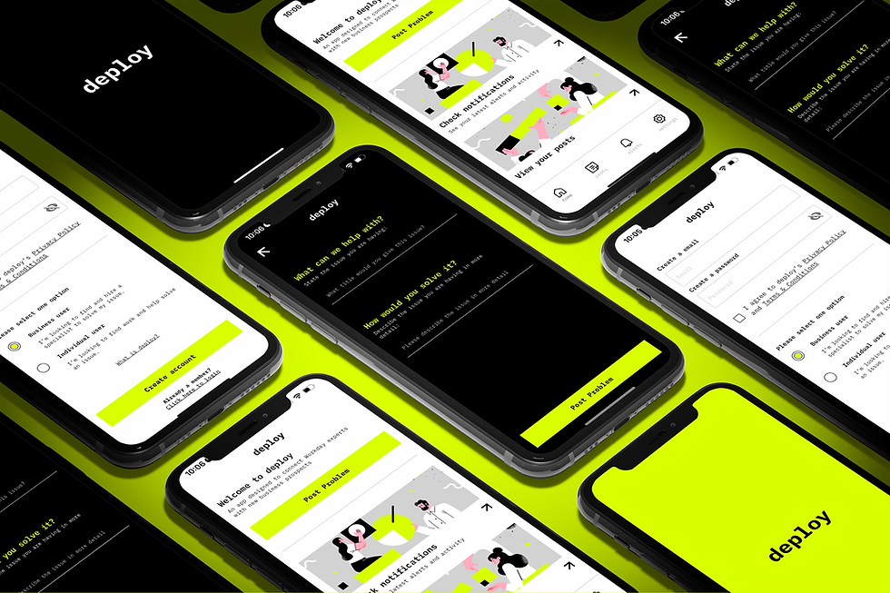
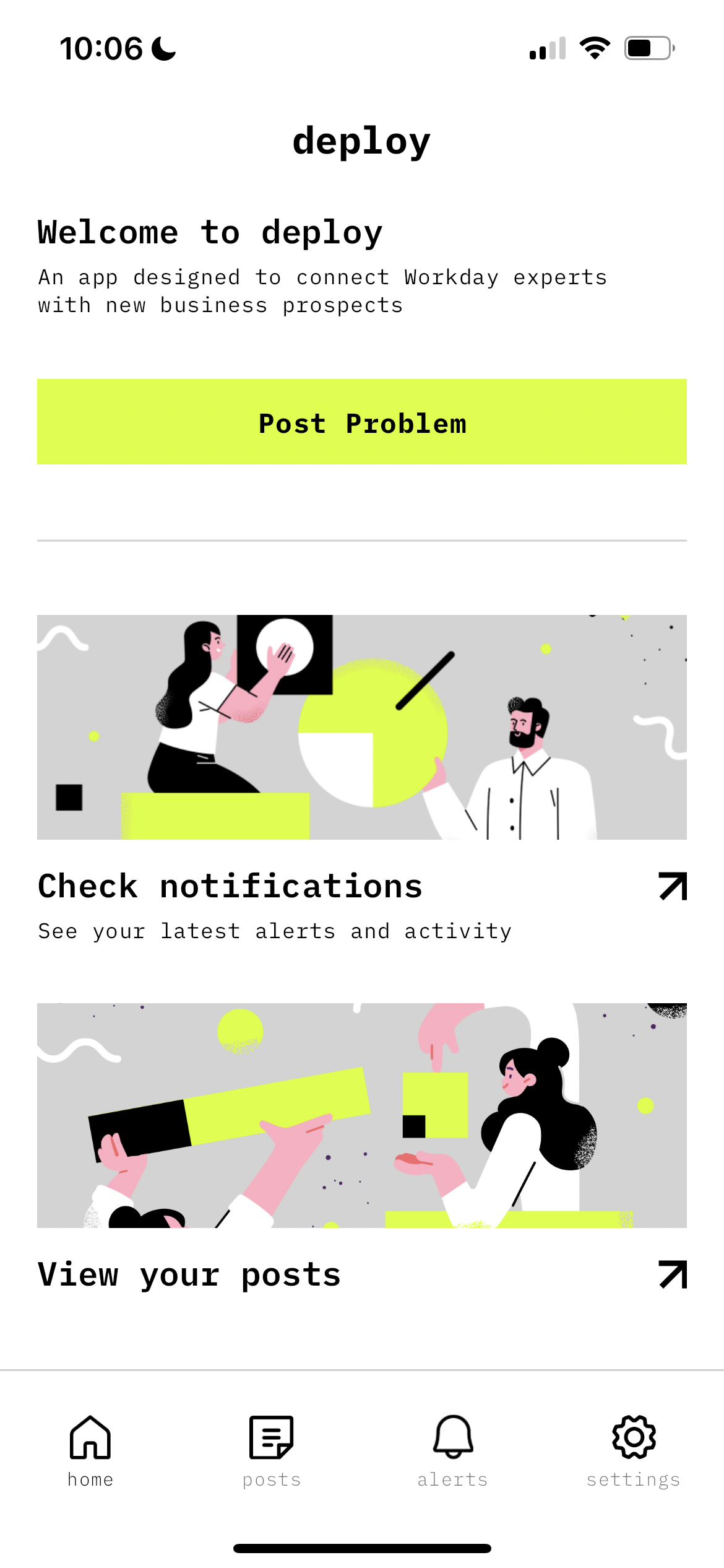
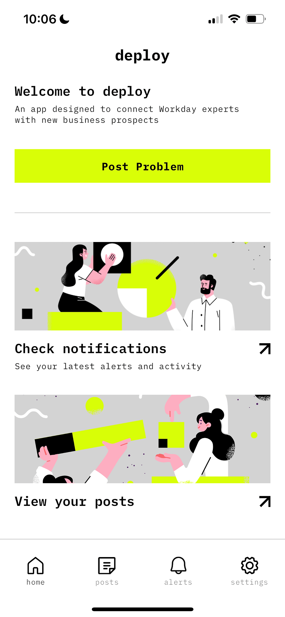
I wanted to create something that was bold, unique, and professional, based on the client’s tech background and the new concept. I used black and white screens to represent the two main types of users (business and professional), and then added a pop of electric yellow colour to highlight the main CTAs.
Typography
The main goal of the app was to make it easy to communicate, so we chose a modern and legible font IBM Plex Mono was the perfect fit because it’s both modern and easy to read. The font also has a slight retro vibe, like an old-school computer hacker/programmer from Hollywood blockbuster in the late 80's.
Colour scheme
The app’s main pages are mostly white and black, with electric yellow as the main call-to-action colour. This works great when used sparingly and helps tie all the illustrations and icons together.
Illustrations
The illustrations are in as a counter balance to the hard hitting colour scheme, they add a playful element to the brands character and could be brought into the other channels such as marketing, advertising and social media to give the brand more flexibility as they grow. Currently in this phase of work the illustrations have been curated and edited from stock imagery but there are plans to translate these into bespoke custom illustrations from a commissioned artist.
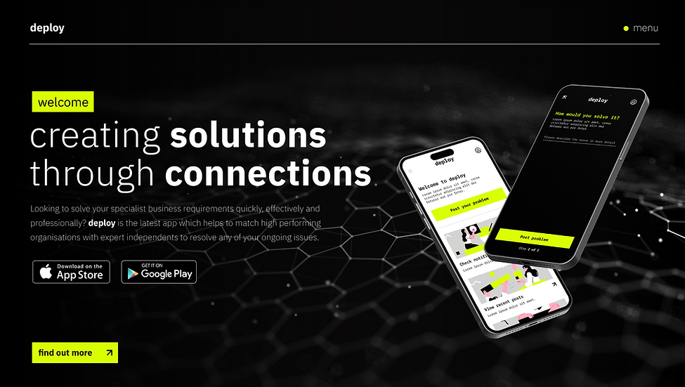
Indicative visual of the overall brand identity in action on a mocked up landing page.
04. Final outcomes
Mian app highlights.
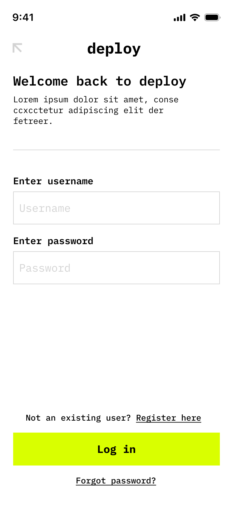
Welcome & account type selection
Prompts new users to identify their role: Business or Professional, establishing a tailored user journey from the outset.
Designed to be visually striking and intuitive, setting a professional tone while subtly introducing the brand’s playful illustration style.
Reinforces Deploy’s dual-sided platform concept in a clear, accessible way from the first touchpoint.
Presents a clean, high-contrast interface with a bold black-and-white aesthetic and strategic pops of electric yellow to signal interaction points.
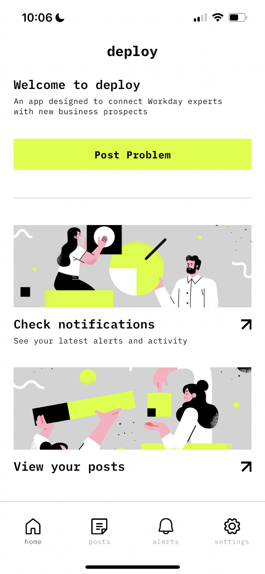
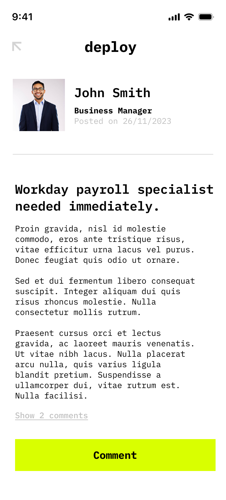
The user dashboard
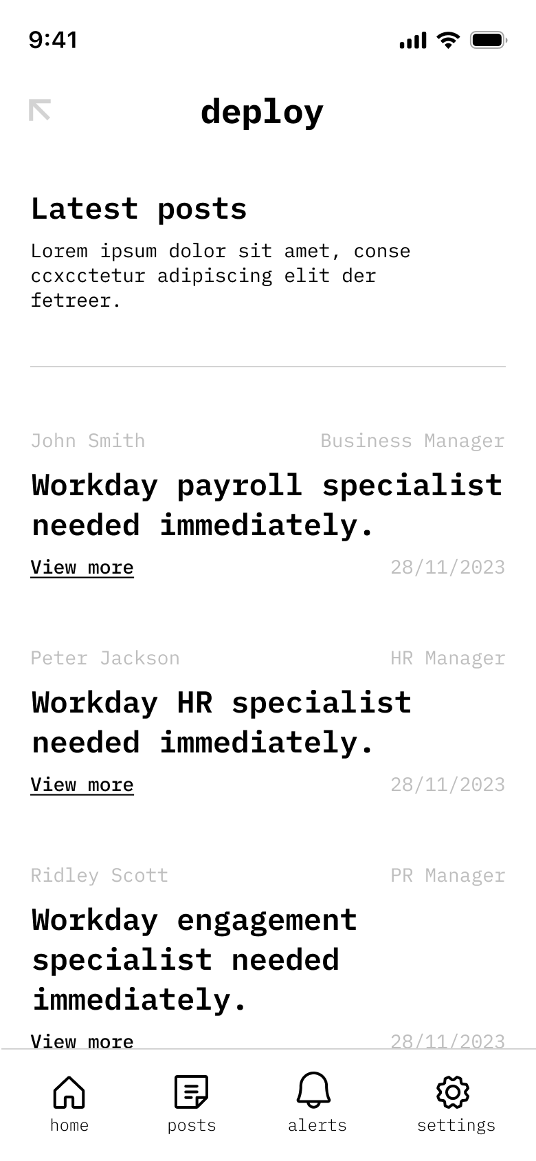
Delivers a minimal yet functional dashboard view, with quick access to job listings, collaborations, messages, and profile insights.
Prioritises clear visual hierarchy using IBM Plex Mono, aiding scan-ability and fast decision-making.
Incorporates subtle illustrative touches to soften the interface and add personality, without distracting from core professional tasks.
Encourages continued use by offering an efficient layout that balances productivity and discoverability.
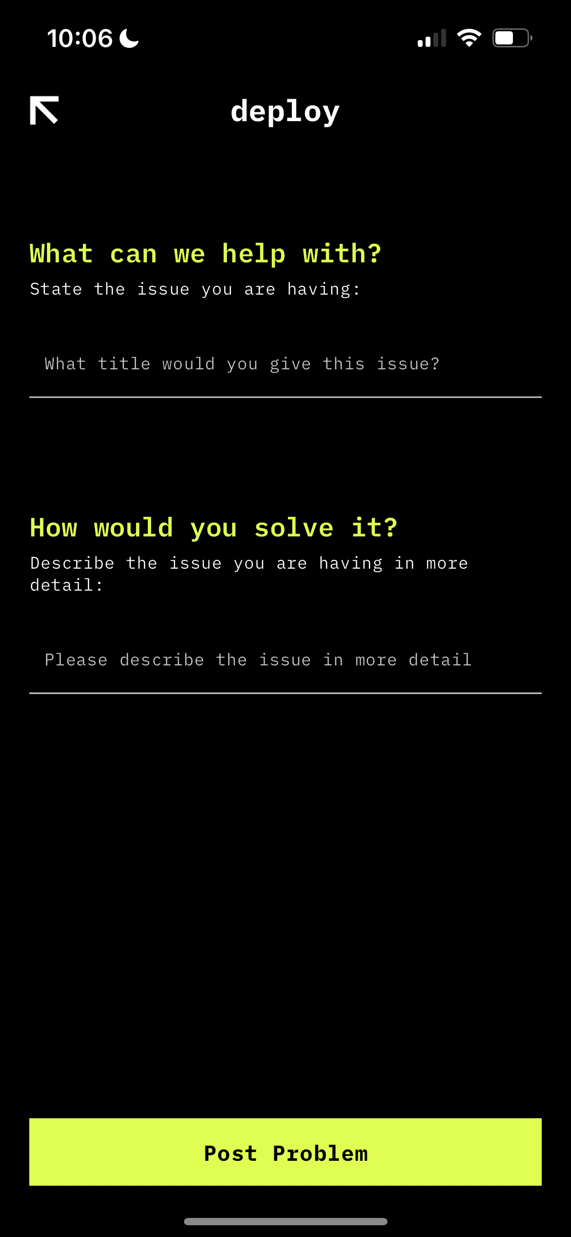
Job/task detail
Displays a full breakdown of a posted task or opportunity, including required skills, estimated timeline, and collaboration features.
Built to support quick evaluation and fast communication between parties, aligning with the platform’s goal of fostering real-time collaboration.
Uses electric yellow accents to highlight key CTAs such as Apply Now, Message Poster, or Save for Later.
Ensures clarity and professionalism while maintaining the app's bold visual identity, helping users focus on value-driven interactions.


