87%
success rate by user testing group when performing & achieving specific app tasks.*
"Extremely positive"
was the #1 response for when the user group was asked to rate the overall look and feel of the app design.**
61%
of users reported that they would find the info resources offered by the app as useful.***


AdaptWell
01. Overview
Newly arrived refugee and immigrant children in the UK often step off the plane into a whirlwind of new words, unfamiliar customs, and shifting routines. While their schools and local councils do their best, in-person English classes and community programmes aren’t always nearby—or they fill up fast.
A mobile-friendly hub could bridge that gap: a pocket-sized companion that serves up bite-sized English lessons, points families toward local services, and links young people with peer groups and mentors who understand what they’re going through. With the right digital support, these children can build confidence in English, make friends faster, and feel at home in their new communities—whenever and wherever they need a helping hand.
Completion Date:
Mar 2025
Project role:
Designer
Project type:
Mobile app
Project length:
4 months
02. Key metrics
Data driven feedback.
* As reported in user focused test group findings 02/02/2025
** As reported in user focused test group findings 09/02/2025
*** As reported in user focused test group findings 09/02/2025
03. Key challenges
A whole new world.
Challenge
The client comes from an academic background and had no previous experience with anything to do with digital products.
Solution
All communication was clear and understandable in the very first instance and avoiding any industry short hand or slang terminology ensuring that the client understood the entire process from start to finish. This really helped to shape the project and deliver an app which really hit the clients brief.
Limited budget.
Challenge
With the primary funding for the MVP phase of the project coming from an academic related grant it was crucial that the design was lean and ultra focussed on achieving the main aims.
Solution
Working in an agile and responsive manor we were able to maximise the design time by having clear communication with the client and a transparent list of actionable task throughout every stage from discovery to prototyping.
Testing, testing, testing.
Challenge
The most crucial aspect of this project for the client was to make sure the app was easy and intuitive to use for the primary users who would be a range of teenagers with potentially very little no to no English speaking or reading ability.
Solution
We designed the first MVP of the app to be used exclusively for testing purposes. Once the app had been built in the first instance it was sent out to a select group of group focus testing where they had a set of tasks to perform and then came back with detailed feedback about how easy the app was to perform and general feedback notes which we fed into the design process for the phase 1 version of the app.
04. Project breakdown
The devil is in the detail.
Overall identity
Without any specific brand identity existing the client was very happy for us to take the lead on this. From the initial meetings we discussed a lot of aspects of the app that would be crucial such as the target audience being teenage so it had to have visual appeal of similar apps such as Instagram or TikTok but still maintain it's primary goal of information distribution amongst a vast community of very different ethnic backgrounds.
Typography
It was crucial that the chosen font was legible and readable in multiple languages and different alphabets such as Urdu and Mandarin. In the end we went for a combination of Mondo for titles and headlines and Noto sans for body copy. We also incorporated emojis into the art direction since they help convert extra meaning across multiple languages and speak directly to a younger target audience.
Colour scheme
For the colour I wanted it to feel vibrant and exciting even though the subject matter of the app is quite somber and serious - having a feeling of a young target audience enjoying using it and getting benefits such as vital information relating to relocating to the UK as refugees was a key aspect.
Illustrations
These little illustrations have a real charm and intrigue to them. I wanted to stay away from using traditional photography because the potential target audience would be very diverse and these illustrations do not rely on looking one specific ethnicity. Currently in this phase of work the illustrations have been curated and edited from stock imagery but there are plans to translate these into bespoke custom illustrations from a commissioned artist at some point in a later phase.

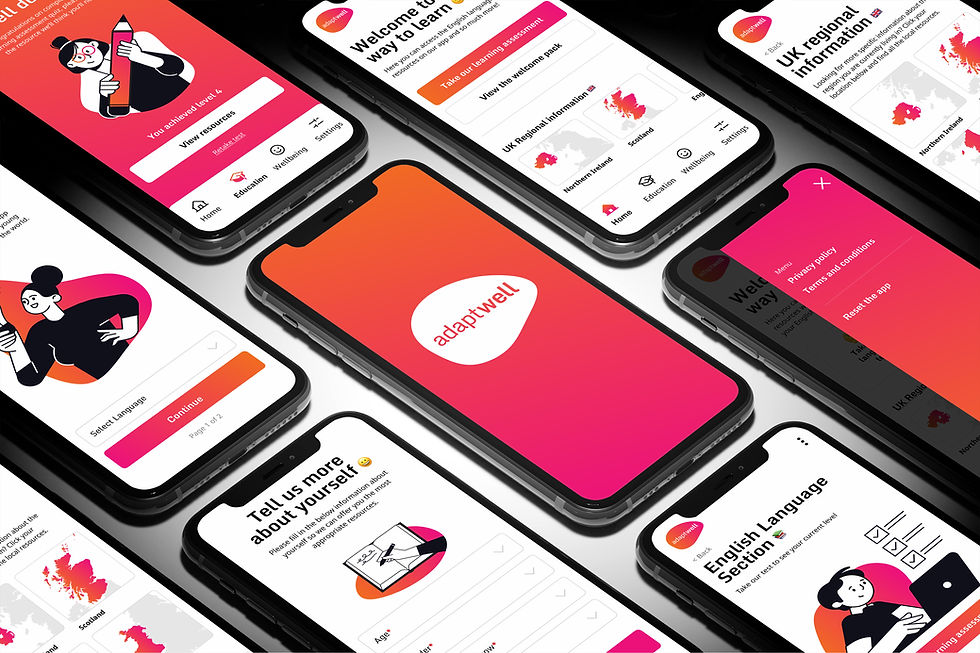
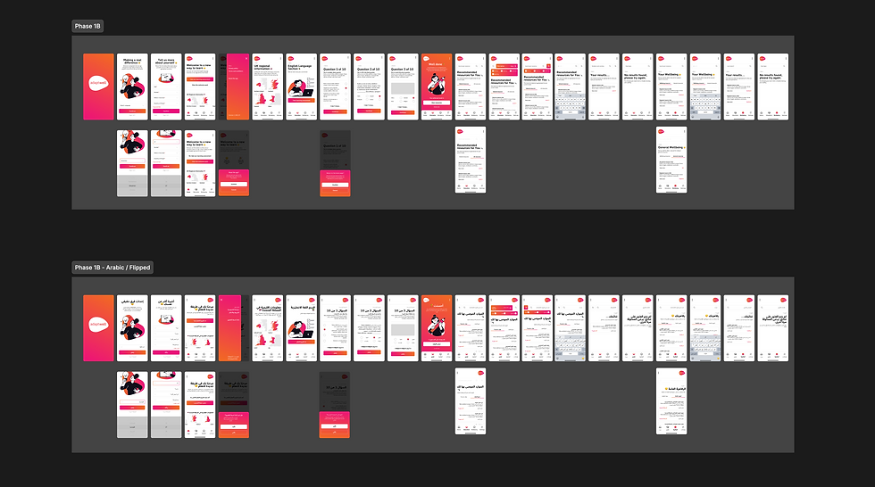
Indicative visual of the way the screens all fit together as a whole.
05. Final outcomes
Mian app highlights.


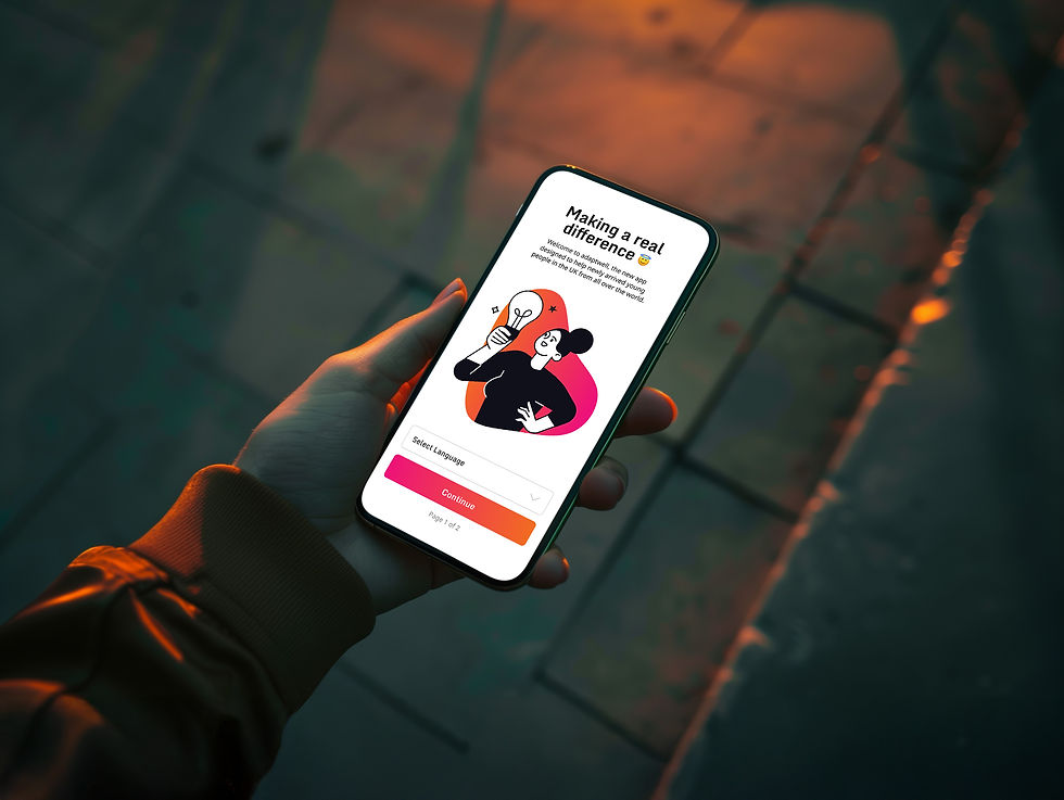
Welcome & language selection
Offers a warm, inclusive welcome with vibrant visuals and emojis to immediately resonate with a young, diverse audience.
Allows users to select their preferred language using universally understood icons and minimal text.
Lays the foundation for an accessible experience for users with little or no English skills.
Sets the tone for a friendly, non-intimidating app experience tailored to newly arrived young refugees.


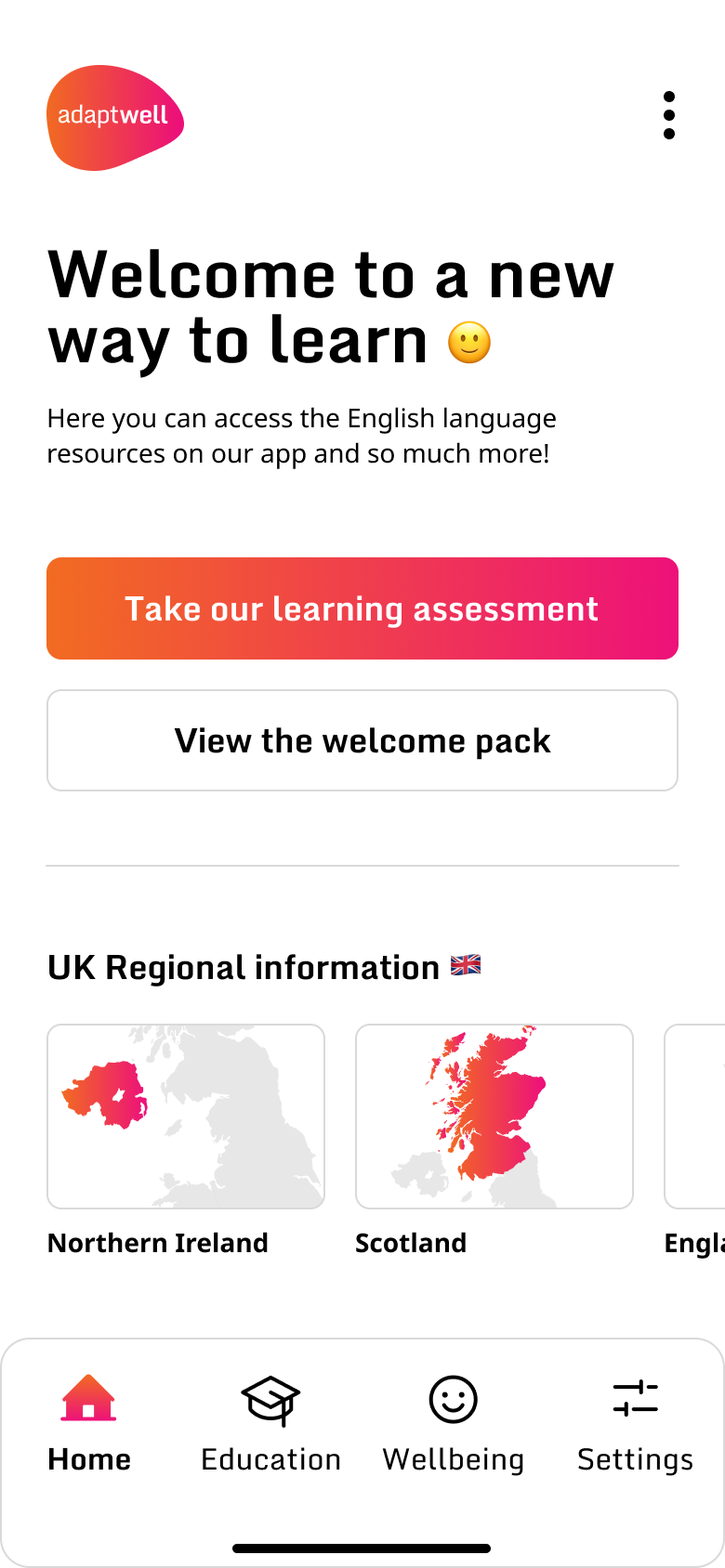
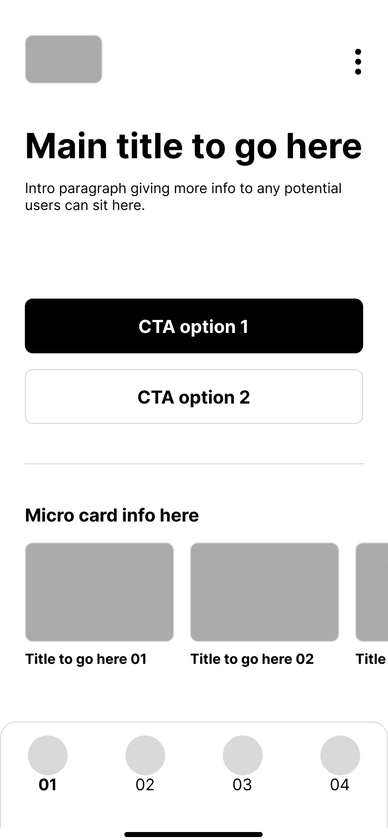
Home dashboard
Presents a simple, intuitive navigation hub with large, illustrated buttons and emoji-based labels for key sections: Learn English, Find Services, Meet Others.
Provides a clear entry point to bite-sized English lessons, local resources, and community support.
Designed to reduce cognitive load and increase confidence through recognisable symbols and minimal text.
Tested thoroughly with focus groups to ensure it’s intuitive even for users with very low literacy or tech skills.


English learning module
Introduces the first set of interactive, bite-sized English lessons using visuals, audio prompts, and emoji-enhanced instructions.
Reinforces language learning with repetition, gamified progress tracking, and immediate feedback.
Built for engagement with clear goals and instant rewards to encourage continued use.
Designed with accessibility in mind, adaptable to multiple alphabets and cultural contexts.